• For users coming over from tmlfans.ca your username will remain the same but you will need to use the password reset feature (check your spam folder) on the login page in order to set your password. If you encounter issues, email Rick couchmanrick@gmail.com

New Logo and Uniform potentially in 2016/17

Status
Not open for further replies.
Nik the Trik said:
Zanzibar Buck-Buck McFate said:
Well, as someone who taps trees and makes syrup I can tell you the new logo depicts a leaf from a red maple, which has serrated edges, rather than a sugar maple, which has smooth edges.  The pic Nik posted is of a (red) red maple leaf.  You can compare them here:

My point isn't so much about the edges as it is the sort of elongated middle.

You mean the logo needs to be elongated around the center axis -- sort of squished?
 
Seems pretty similar to this: https://commons.wikimedia.org/wiki/File:Autumn_Rocky_Mountain_Maple_Leaf.jpg

Don't know why I'm arguing about plant leaves which are all different anyway.
 
Zanzibar Buck-Buck McFate said:
You mean the logo needs to be elongated around the center axis -- sort of squished?

Maybe? What i mean is on the current Leaf logo there's not much space between where it flares out to form the top part and the bottom part. I know I'm not doing a very good job of explaining this but the Leafs logo has typically always had sort of 5 distinct points(6 if you count the stem), right? Bottom left, top left, top middle, top right and bottom right.

But in this new one, and some of the old ones, there are sort of these additional edges between the top left and bottom left(and bottom right and top right) that form a sort of middle or body. So where on the current logo there's basically no room between the bottom of the lettering and the bottom of the logo, on the new one there's quite a bit of space, including room for the "moustache". It's the extra body that allows for that extra room that doesn't seem to be present on any of the pictures of maple leaves we've had.
 
Potvin29 said:
Seems pretty similar to this: https://commons.wikimedia.org/wiki/File:Autumn_Rocky_Mountain_Maple_Leaf.jpg

Leaving aside(get it?) that I don't agree, you can switch it in your head to "It doesn't look like a leaf on any tree that grows within 1000 miles of where the team plays" if that helps.
 
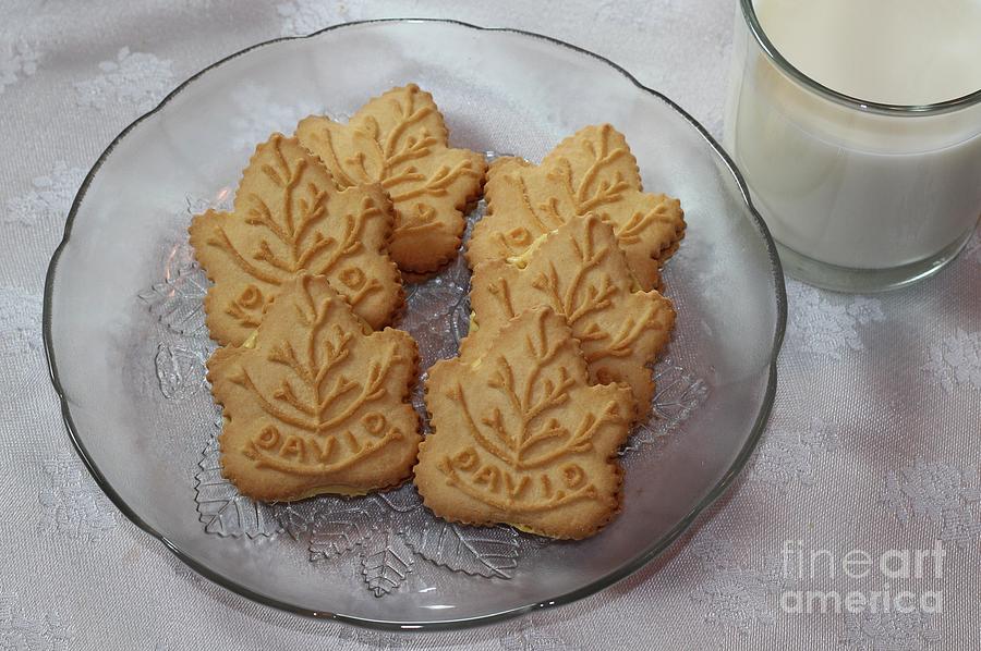
I don't like it all. Every time I see an old Leaf logo or a newer one that resembles the old days, it always reminds me of the Maple cookies the Girl Guides used to sell. Something like these.....

maple-leaf-cookies-and-milk--food-art--kitchen-barbara-griffin.jpg

christie_mapleleaf5.jpg
 
Nik the Trik said:
Zanzibar Buck-Buck McFate said:
You mean the logo needs to be elongated around the center axis -- sort of squished?

Maybe? What i mean is on the current Leaf logo there's not much space between where it flares out to form the top part and the bottom part. I know I'm not doing a very good job of explaining this but the Leafs logo has typically always had sort of 5 distinct points(6 if you count the stem), right? Bottom left, top left, top middle, top right and bottom right.

But in this new one, and some of the old ones, there are sort of these additional edges between the top left and bottom left(and bottom right and top right) that form a sort of middle or body. So where on the current logo there's basically no room between the bottom of the lettering and the bottom of the logo, on the new one there's quite a bit of space, including room for the "moustache". It's the extra body that allows for that extra room that doesn't seem to be present on any of the pictures of maple leaves we've had.

I see what you mean, but after all it is a stylized depiction of a Leaf.  To me, the overall proportions look good.

But you can't please everybody, per the discussion here:

http://www.cbc.ca/news/canada/toronto/new-leafs-logo-reaction-1.3431686
 
Nik the Trik said:
Potvin29 said:
Seems pretty similar to this: https://commons.wikimedia.org/wiki/File:Autumn_Rocky_Mountain_Maple_Leaf.jpg

Leaving aside(get it?) that I don't agree, you can switch it in your head to "It doesn't look like a leaf on any tree that grows within 1000 miles of where the team plays" if that helps.

Not that it matters, but it looks like a stylized silver maple, which absolutely grows within 1000 miles of Toronto. It's stylized by adding more breadth to the body which is necessary to fit the text comfortably.
 
Zanzibar Buck-Buck McFate said:
I see what you mean, but after all it is a stylized depiction of a Leaf.  To me, the overall proportions look good.

Like I said last night, it's fine. These are just deep cuts.
 
Bullfrog said:
Not that it matters, but it looks like a stylized silver maple, which absolutely grows within 1000 miles of Toronto. It's stylized by adding more breadth to the body which is necessary to fit the text comfortably.

Points to you, that's the closest I've seen.
 
By complete coincidence, I'm currently enrolled in a Plant Materials class through Ryerson's continuing ed program and have three books on trees sitting on my desk in front of me.  :)
 
Bullfrog said:
Nik the Trik said:
Potvin29 said:
Seems pretty similar to this: https://commons.wikimedia.org/wiki/File:Autumn_Rocky_Mountain_Maple_Leaf.jpg

Leaving aside(get it?) that I don't agree, you can switch it in your head to "It doesn't look like a leaf on any tree that grows within 1000 miles of where the team plays" if that helps.

Not that it matters, but it looks like a stylized silver maple, which absolutely grows within 1000 miles of Toronto. It's stylized by adding more breadth to the body which is necessary to fit the text comfortably.

What does it matter?  It's Canada's Team.  8)
 
Lets just be happy that in hockey the logos are not corporate sponsorships like Soccer.
Can you imagine the Leaf logo with Tims Hortons in the middle of the crest or Subaru Canada or some other behemoth.
 
Status
Not open for further replies.

About Us

This website is NOT associated with the Toronto Maple Leafs or the NHL.


It is operated by Rick Couchman and Jeff Lewis.
Back
Top